


University Brand Guidelines: Spirit Badge
Spirit badges are flexible brand elements that reinforce school pride and add recognizable moments throughout a layout. They can be used as graphic accents, sticker treatments, or supporting elements to emphasize key messages and create visual interest. While badges should never compete with the primary message, they can help unify a composition and strengthen the East Texas A&M brand across print, digital, and environmental applications.
Spirit badges are secondary supporting graphics. They do not replace the official university logo or eliminate the expectation that the university logo appear first and prominently on materials produced by or on behalf of East Texas A&M University.
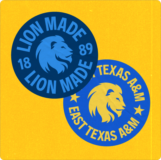
Badges can function as sticker graphic elements to add contrast and can layer over typography and photography. To enhance their tactile feel, apply a subtle paper texture using “Multiply” blending mode. These elements should remain tertiary in the visual hierarchy and never obstruct important content. Sticker badges may be used with or without texture depending on design intent.
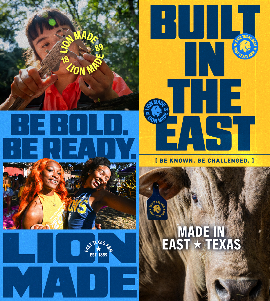
Round Badges
May be used with or without Lion mark. If using without Lion, center thoughtfully in the composition. May also be applied with sticker treatment.

Arched Badges
Used most frequently as a headline flourish on top display type (see right for example). Keep scale in mind, as to not overpower the headline.

Horizontal Badges
Most frequently used as footer graphics, or overlaid onto photos for informal applications such as social.

Color Options
Sticker badges are limited to the approved color combinations shown on this page. Use only these colorways to maintain consistency across all applications. Do not create alternate color combinations or apply gradients, effects, or transparency to the artwork.
Textured Sticker Badge
Textured sticker badges can be used in digital applications to create the appearance of printed stickers, adding depth, personality, and a tactile feel to layouts. When using sticker badges, always use the pre-built assets provided in the East Texas A&M brand library. Each asset includes the approved texture and finish to ensure a consistent look across all brand communications.
Usage
Spirit badges should always act as a tertiary design element to add visual interest.
When using them, it is critical to use a thoughtful design eye. For additional examples of badge usage in the brand, please see the “Our Brand in Action” section.
AI-generated, approximated, recreated, redrawn or otherwise altered versions of the Lion Made spirit stamps, spirit badges are not permitted. Only official, approved artwork supplied by the university may be used.
Sizing
The primary type in the spirt badge should be no smaller than about 6pt font in both digital and print applications. Because these are tertiary design elements they have less strict sizing rules compared to logos. Be mindful of legibility.
These rules apply to every variation of spirit badge. As a general rule, spirit badges should be no smaller than .5″ or 48px.
Do’s and Don’ts:
- DON’T tilt arched or horizontal ones.
- DON’T skew or stretch the proportions of the badges.
- DON’T attempt to manually recreate the badges.
- DON’T vary colors in badges, they should always stay as one color.
- DON’T use use drop shadows or darken the photo beneath badge, rather change the color of the badge for appropriate contrast.
- DON’T obscure subject matter.
Keep tasteful layering in mind. - DO use round badges to highlight a specific part of a photo.
- DO only use brand colors for badges, keeping contrast and legibility top of mind.
- DO use as a small type flourish over display headlines.