


University Brand Guidelines: Textures
To introduce a more tactile quality, apply textural overlays across the full composition, including both photography and typography. For film grain, set overlays to “Color Dodge” blending mode and reduce opacity as needed to tone up/down the effect.
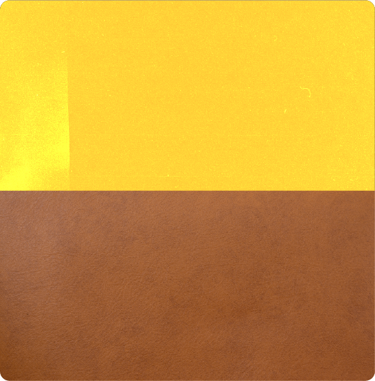
Texture: Film Grain
Texture: Leather
APPLYING TEXTURES
To introduce a more tactile look and feel, apply textural overlays across the full composition, including photography and typography. For film grain, set the blending mode to Color Dodge and adjust the opacity to achieve the desired intensity.
Effects
Use a black grain texture with the blending mode set to Color Dodge.
- Background colors: Use approximately 50% opacity or higher, adjusting as needed.
- Photography: Increase the opacity up to 90% when a more pronounced grain effect is desired.
Use Case
APPLYING TEXTURES
To introduce a more tactile look and feel, apply textural overlays across the full composition, including photography and typography. For film grain, set the blending mode to Color Dodge and adjust the opacity to achieve the desired intensity.
Layer Effects
When Color Dodge is available, use it to apply the texture. If the software does not support Color Dodge, use the provided pre-textured background assets to maintain a consistent appearance across applications.
Elements To Avoid
Avoid using logos, small type, or any other elements that require legibility.
Opacity on Color
Use approximately 50% opacity or higher, adjusting as needed.
Opacity on Photos
Increase the opacity up to 90% when a more pronounced grain effect is desired.
BORDERS
Borders can be used around photography, illustrations, or graphic compositions to add energy and reinforce key brand messages. Select approved copy that naturally supports the content being framed and pair it with approved brand color combinations for maximum contrast and accessibility.
Color Examples
Use Cases
MAKING BORDERS
Border treatments help frame photography and graphic compositions while reinforcing the East Texas A&M brand. Use approved colors and messaging that complements the content being framed. Borders should support the composition without distracting from it, and copy should be adjusted as needed to create a balanced, continuous wrap around the artwork.

CORNERS
- Em Dash: When copy terminates at the edge of the photo, connect the adjacent 90° border copy with an em dash. Adjust the length of the em dash as needed to create a continuous border and fill the corner gap.
- Space: When copy does not terminate at the photo edge, wrap the copy around the corner and continue the message on the adjacent side.
- Example P. 63 – Use Cases – Example 2
FONT TREATMENT
- Font: DIN 2014 – Demi
- Tracking: Adjust tracking so copy terminates at the photo edge and aligns cleanly with the corner em dash without creating awkward gaps.
- Size: Border type should generally be between 1/3 and 1/2 the width of the border.
TYPE CENTERING
Center the copy and corner em dashes on each side of the composition. Type should also be visually centered relative to the edge of the photo it frames.
TYPE ORIENTATION
Border copy should always face inward toward the composition.
Rotate type as needed so it reads correctly on each side while maintaining an inward-facing orientation. The bottom edge should be rotated 180°, and the left and right edges should be rotated to face the center of the image.