


University Brand Guidelines: Typography
Typography is key to how we read and understand information, especially numerical data. Our brand typefaces have been chosen for legibility and clear forms. We also have considered
how we apply our brand fonts for maximized visibility and improved information hierarchy.
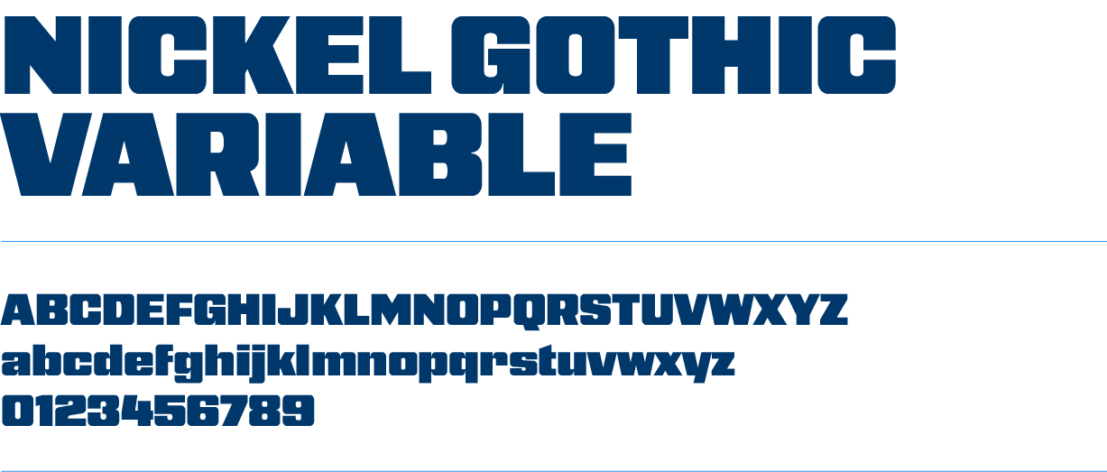
NICKEL GOTHIC VARIABLE
A bold, condensed display typeface with heavy-slab like strokes and squared-off geometric letterforms. The overall feel is industrial, athletic, and impactful, similar in spirit to Impact but with a more angular, mechanical edge.
USAGE
Nickel Gothic Variable is reserved for headlines
and display copy and should always be set in ALL CAPS. This font is available for download through Adobe Fonts.
SYSTEM ALTERNATIVE
Impact
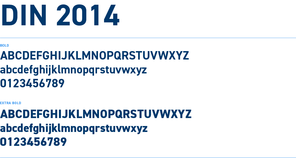
DIN 2014
A clean, geometric sans-serif typeface with a technical, engineered feel. The Bold and Extra Bold weights are sturdy and highly legible, giving a modern, functional, and slightly utilitarian character.
USAGE
Din 2014 (Bold and Extra Bold) is reserved for subheads and eyebrows. It is also used across all environmental signage on the university. This font is available for download through Adobe Fonts.
SYSTEM ALTERNATIVE
Arial
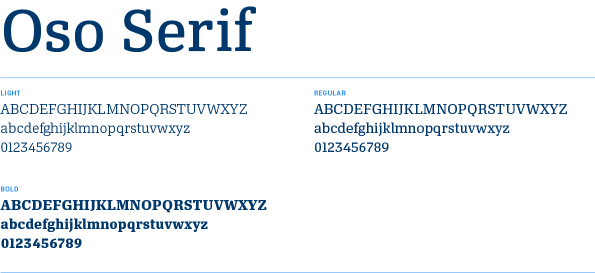
OSO SERIF
A traditional, elegant serif typeface with classic proportions and moderate stroke contrast. The overall tone is bookish and editorial making it well suited for body copy and subheads where a literary, trustworthy feel is desired.
USAGE
Oso Serif (Light, Regular, and Bold) is reserved for subheads and body copy only. This font is available for download through Adobe Fonts.
SYSTEM ALTERNATIVE
Georgia
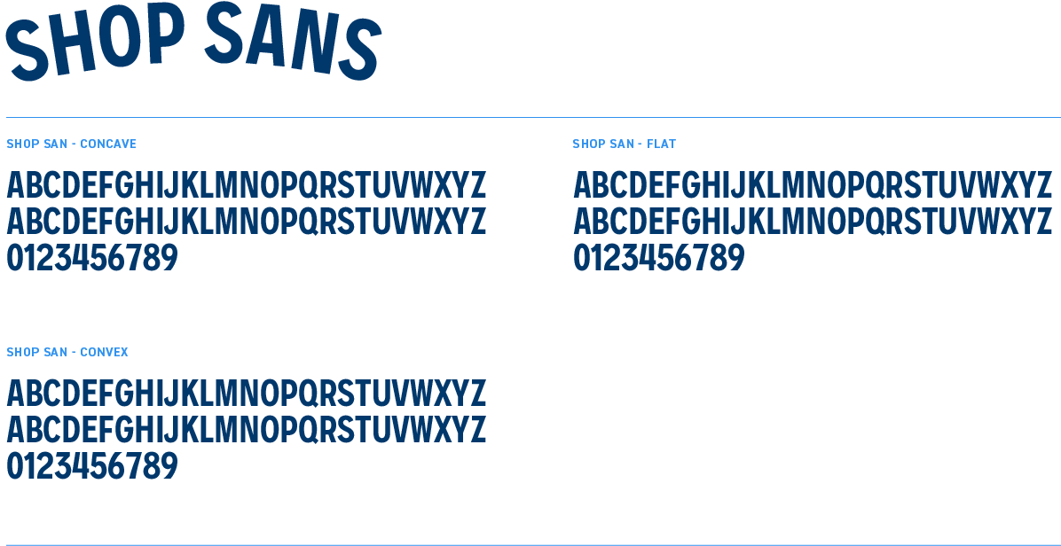
SHOP SANS
Shop Sans is a typeface for setting text on circles and curved text paths. Its ‘Curve' variable font enables adjustments to optimize details for bending type smoothly with an adjustable radius. The normal non-curved variant can also be used in standard settings. The design channels a general workaday feeling from 20th-century commercial and industrial letters.
USAGE
Shop Sans should only be used for new badges in rare cases. Existing badges are trademarked. This font is available for purchase through futurefonts.com/hex/shop-sans
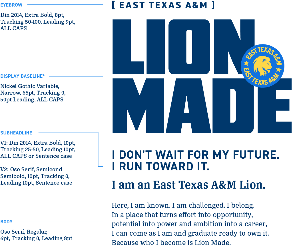
TYPE HIERARCHY
These examples are not comprehensive, rather a starting point for the flexibility of the type hierarchy.
*Shown is the suggested starting place for display type. Begin with these specs, and then begin to adjust width specific to the composition.
VARIABLE TYPOGRAPHY
For maximum impact, use Nickel Gothic Variable at varying widths to fully occupy and balance compositions. Our primary focus is the width axis. Slant should be reserved only for rare, one-off applications.
In most applications, type should be centered, adjusting the width variable to take up maximum space.

Suggested Layout
Keep a consistent text measure and adjust the width axis—not the point size—to balance each line. This approach creates a cohesive composition while preserving the intended hierarchy and readability.