


University Brand Guidelines: Color Palette
People recognize great brands by their color as much as their names. Our university's colors—blue and gold—have been a part of our history and visual identity for generations. These colors should be used thoughtfully in marketing materials to create a consistent and distinctive visual voice.
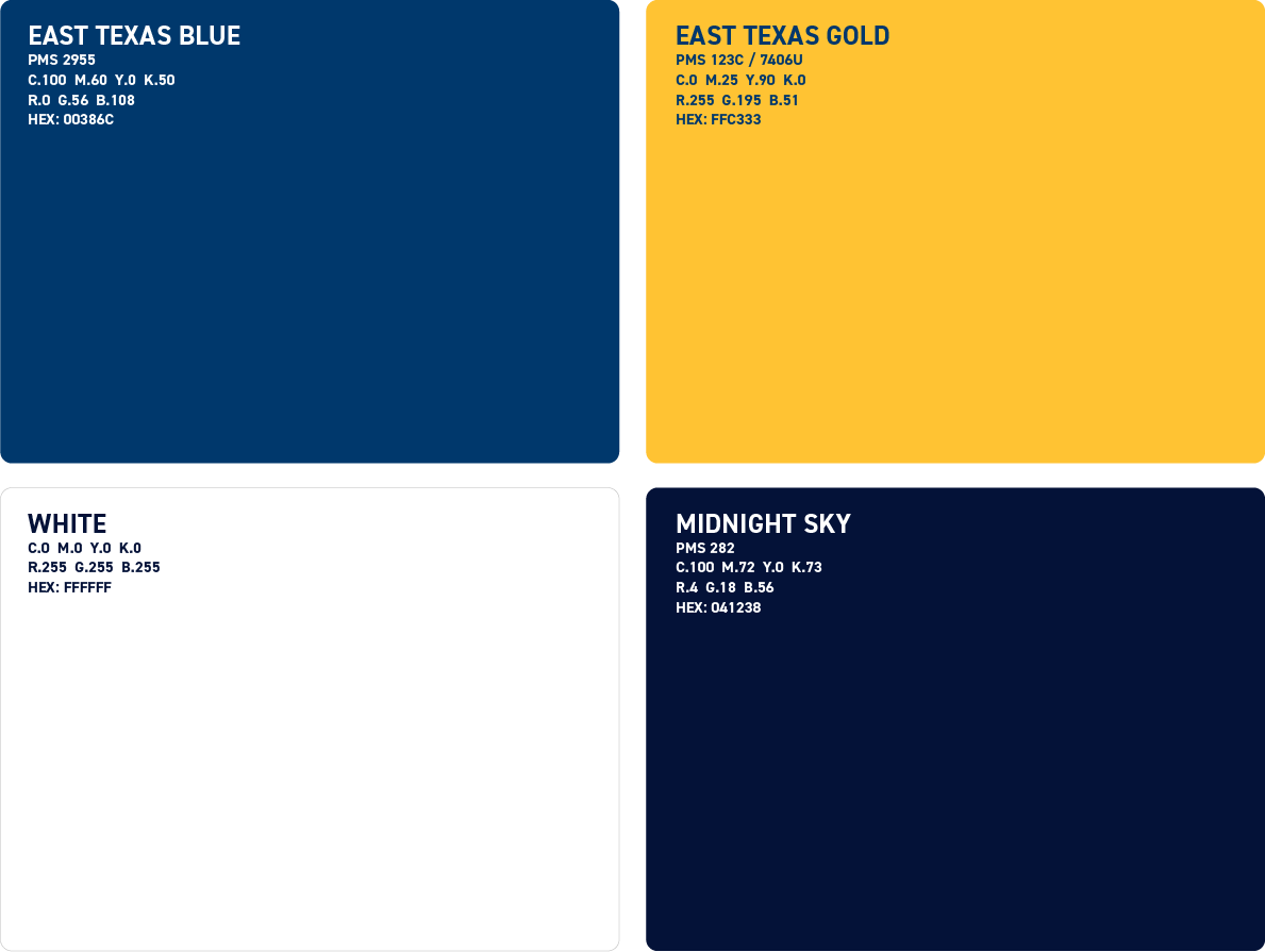
PRIMARY COLOR PALETTE
These are the university's primary brand colors.
SECONDARY COLOR PALETTE
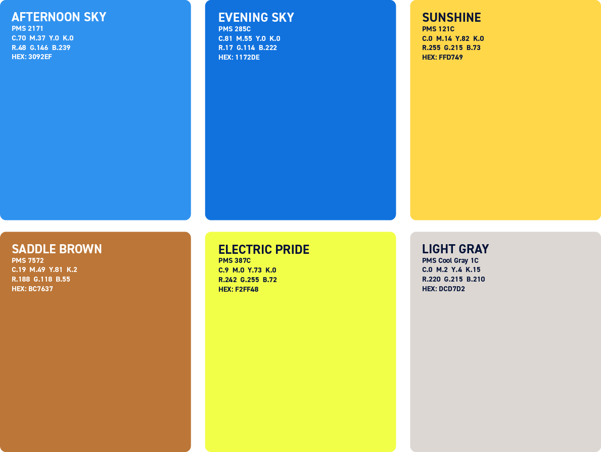
The secondary color palette can be used to add a different tone to a design while remaining true to the university's official primary brand colors.
WEIGHTED USAGE
Where the Contrast Guidance pages determine our options for color use, the weighted usage palettes help us determine how and when the colors in our palette should be used.
While our color system is flexible, be careful to exercise restraint.
Unique and exciting color palettes can be created using as few as three or four colors.
Generally our design should rely predominately on the primary palette.
The complementary palette was developed to support the primary colors by adding variety to typography, backgrounds and graphic elements.
The secondary palette is used for small accents where a wide range of colors is needed, like infographics.
Formal Example

Informal Example

CONTRAST COMBINATIONS
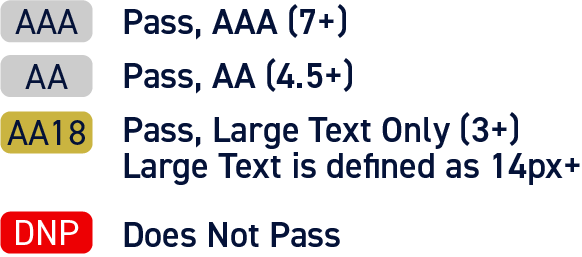
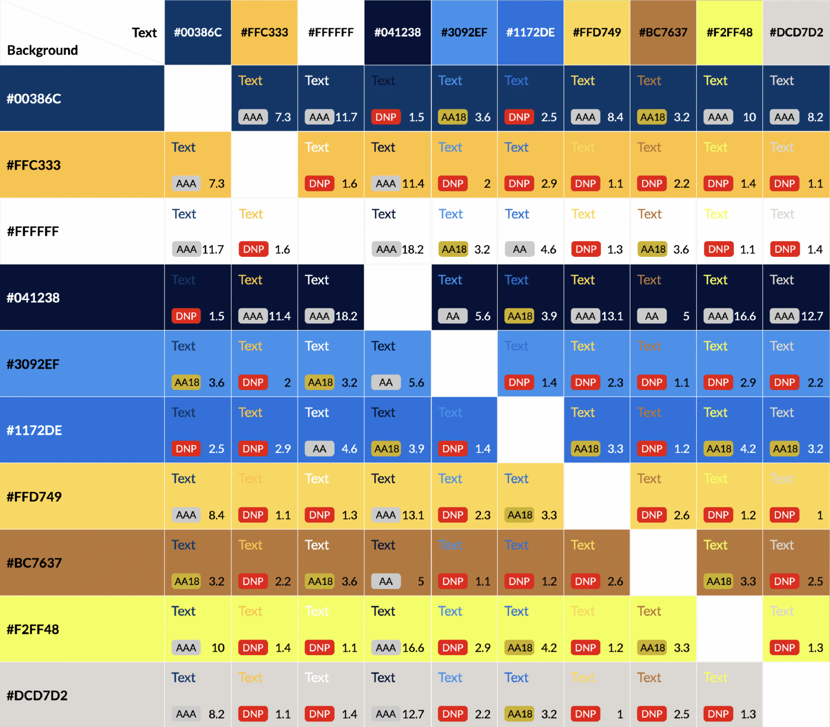
Sufficient color contrast is essential for creating content that is accessible to all audiences. The contrast combinations shown in this guide have been evaluated against the Web Content
Accessibility Guidelines (WCAG) and identify which foreground and background color pairings meet AA and AAA standards for readable typography across digital experiences.
Contrast Guidelines
Color contrast plays an important role in creating clear, legible communications. The recommended color pairings shown in this section have been selected to provide strong readability while preserving the integrity and consistency of the East Texas A&M brand.
PAINT AND MATERIAL SUGGESTIONS
Our visual language should come to life in our environmental spaces in additional to print and digital ones. Here are some recommendations for paints and materials to consider that align to our brand. These are not hard-and-fast requirements and should be used to inform decisions across projects.
When purchasing paint, bring the Pantone (PMS) shades to the vendor to ensure accurate matching.